
Designing With the Landscape
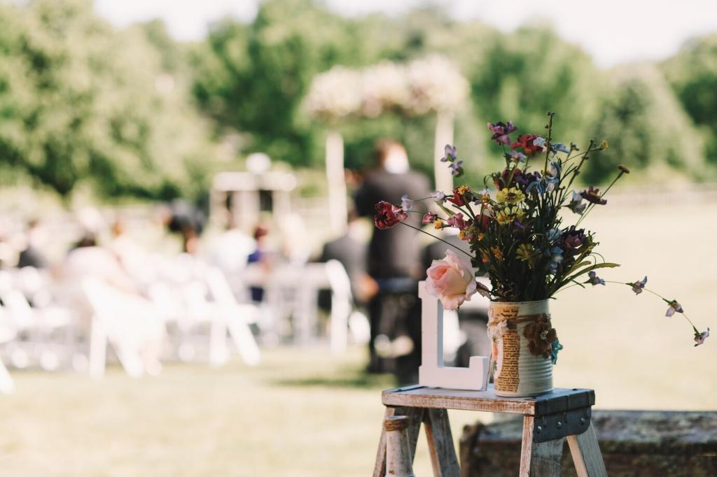
Echo lake blues with dusty periwinkle glassware, then soften with sage linens to bridge water and grass. This borrowed palette calms tension between zones and lets floral accents glow rather than fight the view.
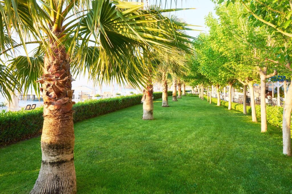
Designing With the Landscape
Grass, gravel, and decking each influence footwear, movement, and mood. Use rugs to connect surfaces, creating safe thresholds where color whispers direction, and texture signals comfort without erecting visual walls or clunky signage.